Our integrated design, development, and marketing teams are here to turn your ideas into impactful products and campaigns. Contact us to get started.

No commitment
Do You Actually Need a Design System? A Decision Guide for Product Teams
.jpg)
April 21, 2026
Only 40% of design systems are considered successful by the teams that built them. The two failure modes are mirror images: building too early (before the product stabilizes, creating expensive waste when you pivot) and building too late (accumulating inconsistency debt that costs 3–5× more to retrofit than to prevent). This guide gives product teams a framework for getting the timing right — covering when to invest, what level of system is appropriate for your stage, whether to build or extend an open-source foundation, and how to avoid the adoption failure that kills most systems.
The Masterly Design System Readiness Framework maps four dimensions — Signal, Scope, Stack, and Stewardship — to help teams make this decision without guessing. If you're pre-PMF: don't build a formal system. If you're post-PMF with 3+ designers or 5+ frontend engineers and the same UI patterns keep appearing: it's time.
Most product teams ask the wrong question. They ask "should we build a design system?" when the answer is almost always yes — eventually. The question that matters is when, and getting it wrong in either direction is expensive.
According to research by Storybook and Brad Frost, only 40% of design systems are considered successful by their own teams. The failures cluster into two predictable patterns: teams that built too early, optimizing UI infrastructure for a product that pivoted six months later. And teams that waited too long, inheriting years of inconsistency debt that no one had the runway to fix.
This is a timing problem more than a design problem. And like most timing problems, it looks obvious in retrospect and genuinely difficult in the moment.
What a Design System Actually Is (And What It Isn't)
Before the decision, a definition — because this is one of the most consistently misunderstood terms in product.
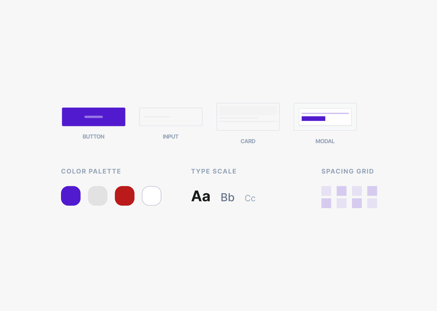
A component library is an artifact: the actual buttons, inputs, cards, and layouts, in code or in Figma. It's the thing you can point to.
A design system is everything around it: the design tokens that define your visual language, the documentation that explains decisions, the governance that keeps it consistent, and the shared mental model between design and engineering. Brad Frost's definition is worth quoting precisely: a design system is
"a living, funded product with a roadmap and backlog serving an ecosystem."
Not a style guide. Not a Figma file. A product that serves other products.
Most teams that say they're building a design system are actually building a component library. That's fine — a component library is often the right thing to build. But treating it as a complete design system creates a gap between expectation and reality that leads directly to adoption failure later.
The Real Question: Explicit vs. Implicit
Every product already has a design system. The question is whether it's explicit or implicit.
A two-person startup that chose Tailwind defaults and shadcn components has made systemic decisions about spacing, color, and typography. Those decisions exist — they're just undocumented, inconsistent, and living in individual engineers' heads. The investment question is when to make those decisions explicit, shared, and defended.
Pre-PMF, UI is experimental. You will rewrite it. Investing in infrastructure for UI that doesn't exist yet is the definition of premature optimization, and experienced design leads consistently describe it the same way:
"We paused product work to finish the system, delayed launches, and ended up as an organizational bottleneck."
Post-PMF, UI is an asset. It represents real design decisions that deserve infrastructure. The inconsistency debt that accumulates when you wait too long is harder to see until it's everywhere — five button styles, three spacing scales, UI decisions copied from the last thing an engineer saw rather than from any intentional standard.
Six Triggers That Tell You It's Time
Stage and headcount are rough proxies. The real signals are behavioral. Experienced design leads consistently point to the same triggers — these matter more than funding round or team size:
The rule of three.
The first time you build a UI pattern, just build it. The second time, copy it. The third time, extract it into a shared component. This rule scales: the third time designers debate "which shade of gray for borders," it's time for a tokens file. The third product surface that needs coordinated UI (app, marketing site, mobile) is when shared language stops being optional.
Your third frontend engineer joins.
Before that, code review handles consistency informally. After that, conventions become tribal knowledge that doesn't transfer during onboarding. If a new engineer takes more than a day to understand "how we do UI here" — the system is already overdue.
Inconsistency that users or sales notice.
When a customer says "your onboarding looks different from your dashboard," or a sales rep struggles to demo a product that looks unfinished — that's the moment. It's not a visual problem at this point. It's a credibility problem.
The first designer hire beyond the founding designer.
Two designers working without shared standards will immediately diverge. Every week without a shared library is a week of diverging decisions that someone will eventually reconcile.
You're preparing for a product launch or fundraise.
Both require a product that looks intentional. A design system doesn't need to be complete for this — it needs to be directionally consistent.
The moment tribal knowledge stops transferring.
When new hires can't find where decisions live, or when the answer to "why does this work this way" is "ask [specific person]" — the system is already failing silently.
Notably absent from this list: "we raised a Series A" or "we hired a designer." Money and headcount enable investment but don't themselves justify it.
Stage-by-Stage: What to Build When
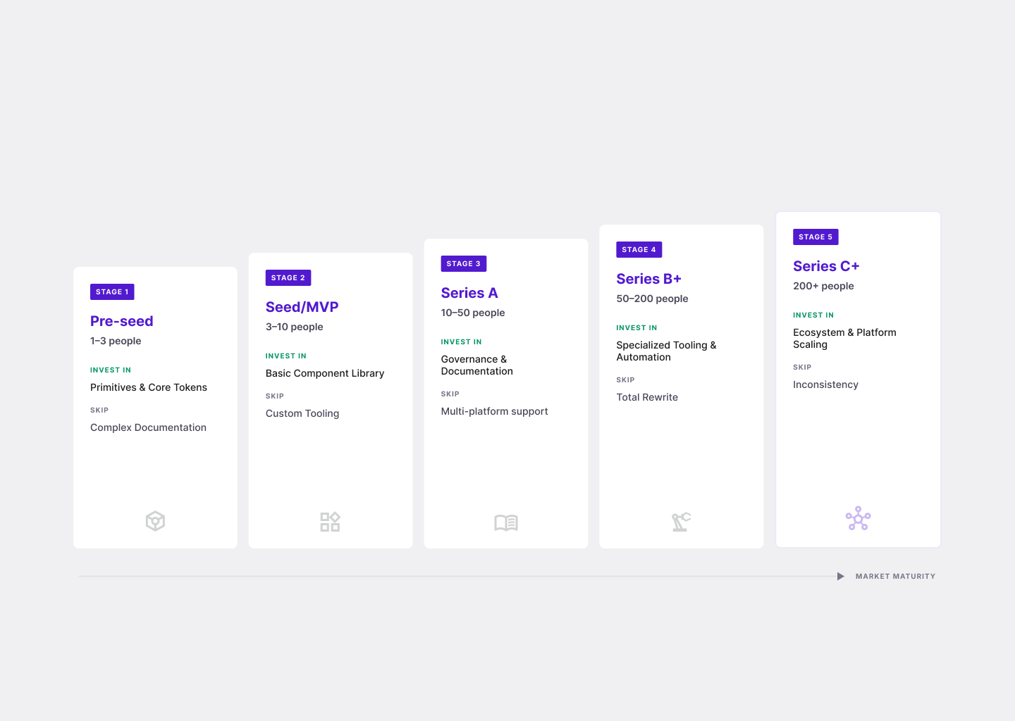
The critical insight: the table describes what to make explicit at each stage, not what exists. The tokens, the components, and the decisions already exist at every stage. The investment is in making them visible and shared.
Build vs. Buy in 2026
This used to be a harder question. In 2026, for most web product teams, the answer is almost always: extend, don't build from scratch.
The modern lean stack looks like this: shadcn/ui (or Radix UI, Mantine, or Chakra, depending on your aesthetic and framework) for the component layer — accessible, composable React components that you own and can modify. Tailwind CSS with a custom tailwind.config.js that encodes brand tokens as the single source of truth for color, spacing, and typography. A mirrored Figma Variables file that references identical values, so designers and engineers share one language.
According to Supernova's State of Design Tokens 2024 report, 69.8% of design teams have already adopted Figma Variables — making tokens, not components, the true foundation of a modern design system. The teams winning in 2026 are the ones that established this token foundation early and everything else follows from it.
What this stack gives you: a system that can be stood up in a day, carries a product from pre-seed through Series A without meaningful refactoring, and — critically — produces better output from AI code generation tools. Vercel's v0, Cursor, and other AI codegen tools default to shadcn + Tailwind. A team with this stack gets faster AI-assisted development as a side effect of having a design system. This is the first genuinely new argument for earlier design system investment in a decade: a token file and component library is now AI scaffolding, not just design infrastructure.
What to skip at this stage: a documentation site, a dedicated design system designer, custom-built components that duplicate what Radix already ships, Storybook coverage for every variant. Those are artifacts of maturity, not foundations.
If You're Vibe Coding, You Need This More Than Anyone
There's a new reason to care about design systems — and it's the most compelling one in years.
AI coding tools have made it possible for a two-person team to build, ship, and iterate a product at a pace that would have required five engineers two years ago. Tools like Cursor, Claude, Bolt, Lovable, and Vercel's v0 can generate working UI from a prompt in seconds. This is real, and it's changing how products are built.
But here's the problem nobody talks about when they demo vibe coding: AI generates inconsistent UI by default.
Ask AI to build a modal — it picks colors. Ask it to build a button — it picks different colors. Ask it to build a form — different spacing. Different font size. Different border radius. Each component is fine in isolation. Together, they look like five different products assembled in a weekend.
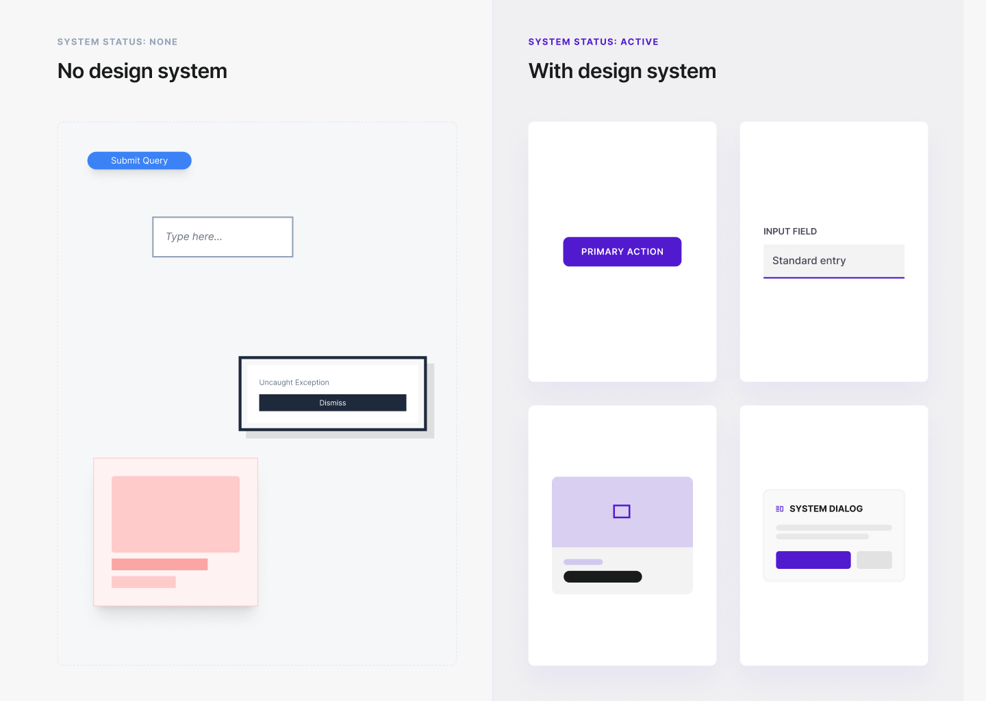
This happens because AI has no constraint. It's generating from pattern, not from your product's visual language. It doesn't know that your primary color is #5B4AE8, not #6B48FF. It doesn't know you use 4px border radius, not 8px. It doesn't know your type scale. So it guesses — and it guesses differently each time.
A design system is the constraint layer that makes AI output consistent.
When Cursor or Claude has access to your shadcn components, your Tailwind config with defined brand tokens, and your component documentation, the generated UI actually looks like your product. The AI isn't guessing anymore — it's working within a system. It knows your colors because they're in tailwind.config.js. It knows your button because it's a named component with defined variants. It knows your spacing because the scale is explicit.
Teams that have figured this out treat their design system as infrastructure for AI, not for designers. The token file is a prompt. The component library is a constraint set. The naming conventions are context. Everything that makes a design system valuable for human engineers makes it equally valuable — arguably more valuable — for AI engineers.
The practical implication: if your team is using AI to build any part of your product UI, the minimum viable design system is no longer optional. A tailwind.config.js with your brand tokens is the difference between AI that produces on-brand output and AI that produces "close enough but not quite right" output that someone has to manually fix after every generation cycle.
The 2026 stack (shadcn + Tailwind + Figma Variables) was already the right answer for human teams. It's now also the right answer for AI-assisted teams — which, at this point, is nearly everyone.
Why Most Design Systems Fail: The Adoption Problem
The 60% failure rate isn't a design problem. It's an adoption problem.
The most common failure pattern: a senior designer joins, spends four months building a comprehensive Figma component library, and ships it. Engineering never adopts it, because the product pivoted twice during the build and because nobody asked engineering what they needed. The system is technically complete and functionally abandoned.
The governance lesson from every mature system — Shopify Polaris, Atlassian Design System, IBM Carbon, GitHub Primer — is that successful systems are contribution-friendly from day one, even if the formal contribution process doesn't exist until later. Brad Frost's framing is precise: the design system team should provide ingredients, not finished meals. Product teams should be able to build their own components using system primitives, with the design system team curating which recipes graduate into the shared library over time.
Systems that fail are almost always gate-kept by a small central team that product teams either wait on (frustration), fork (fragmentation), or bypass entirely (invisibility). All three outcomes destroy the consistency the system was supposed to deliver.
Measurement matters more than most teams realize. Pinterest built an internal tool called FigStats that scans every Figma file nightly and computes a component adoption percentage. They open-sourced it because without adoption metrics, design system budgets are among the first cut in downturns — which happened extensively during 2023–2024. If you can't show component reuse rates and token coverage, you can't defend the investment.
The ROI Question (For the CPO)
Design system ROI doesn't show up on a single sprint. It shows up in four places over time.
Velocity.
The most consistent ROI claim from teams with mature systems: new feature UI takes hours, not days. Engineers stop making spacing and color decisions from scratch. Designers stop specifying components that already exist.
Consistency.
Every inconsistency in a product is a decision that will be revisited. Five button styles means five debates, five QA cycles, five places to update when the brand changes. A design system trades a one-time investment for ongoing reduction of that overhead.
Onboarding.
When design conventions are documented and accessible, new hires become productive faster. The "how do we do X here" question has an answer that doesn't require the founding designer.
AI leverage.
A team using Cursor, Claude, or v0 without a design system gets inconsistent UI that someone has to manually clean up after every generation cycle. A team with a token file and component library gets on-brand output by default. The design system becomes the constraint layer that makes AI work correctly — not just faster, but consistently.
The clearest signal that a design system is working: the conversation about "should we build a new component" shifts from "let me create this from scratch" to "is there already a component for this?" That shift usually happens within 3–6 months of a system reaching critical mass.
Masterly Design System Readiness Framework
Four questions that determine whether your team is ready to invest — and at what level.
A team that scores "investment signal" on all four dimensions has already waited too long. The goal is to move from implicit to explicit on each dimension before the signal becomes a fire.
The deepest insight from a decade of design system post-mortems applies here: the system is not the artifact — it is the agreement. A two-page README describing "we use these six colors and these four font sizes" is a more valuable design system than a 300-component Figma library that no one opens. Teams that remember this tend to succeed. The 60% that end up in the failure column tend to have forgotten it.
If your team is spending more time debating UI decisions than shipping features — or if your product looks different across every surface — the problem is usually not execution. It's the absence of a shared agreement.
We help product teams build design systems that engineering actually adopts: lean enough to ship fast, structured enough to scale.
Talk to us about your design system →
Related: How to Conduct a UX Audit · Fintech Design in 2026: Why Most Apps Look the Same · The Complete Guide to SaaS Onboarding UX
Frequently Asked Questions


